

Yes, an Unrealized Loss Is Still a Loss
The S&P 500 reclaimed its 1972 real high in 1984. A retiree drawing 4% was at 39 cents on the dollar and never recovered, without ever panic selling.
Peter Mallouk, chief executive of Creative Planning, posted this chart with the caption: “The S&P 500 has returned an average of 12% per year since 1980 and has done so despite an average intra-year drawdown of 14%, and often drawdowns that are much worse. The lesson? Volatility doesn’t equal a permanent loss unless you sell.”1
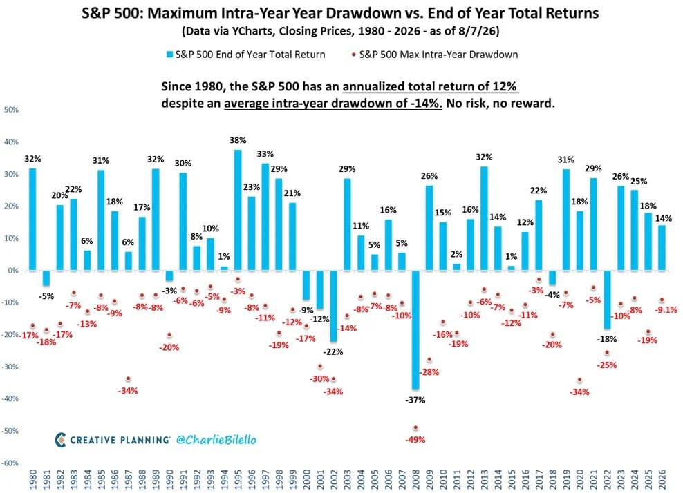
Chart by Charlie Bilello for Creative Planning, data via YCharts, 1980 to 2026 as of 8/7/26. Shared by Peter Mallouk on X.
Each blue bar is a calendar year’s total return. Each red dot below it is the worst peak-to-trough decline that happened inside that same year. The pairing is the argument: the bars are mostly positive even though every year has a dot under it.
The first sentence of that lesson is sound. Ordinary equity volatility is not the same thing as permanent capital loss, and most investors who sat through the declines on this chart were fine. The second half supplies the wrong mechanism. Selling is not what converts a decline into a permanent loss, and refusing to sell is not what prevents one. The same claim circulates in a shorter form, “it’s not a loss until you sell,” and both versions rest on the same idea: that the sale is the event that makes a loss real. Where this piece says “the slogan,” it means that shared idea.
The short version
A position that falls from $100 to $60 leaves you holding $60 whether you sell or not, because selling exchanges $60 of stock for $60 of cash. The price decline created the loss; the sale only recognizes it. What determines whether the loss turns out to be permanent is what happens to your real purchasing power over your horizon, and that runs on its own schedule regardless of what you click. We ran the arithmetic on 98 years of inflation-adjusted returns: the S&P 500 reclaimed its 1972 real high in 1984, but a retiree who started drawing an inflation-adjusted 4% a year from a 60/40 portfolio at that peak was down to 39 cents on the dollar in 1984 and never got back to even. They never panic sold. They sold to eat.
What the dots measure
Two words get used interchangeably here and they measure different things. Volatility is the standard deviation of returns, a dispersion statistic computed across an entire return series, in which upside and downside moves contribute equally.2 A drawdown is a single path-dependent decline from a prior high. The dots are the largest peak-to-trough drop inside each calendar year, which makes them a series of annual extreme values rather than a measure of variation. If you want the vocabulary for measuring this properly, we covered drawdown depth, time underwater, and the Ulcer Index in Portfolio Risk Is More Than Volatility.
The chart’s own annotation puts the average intra-year drawdown at 14% since 1980, computed from closing prices, and an independent source lands in the same place: J.P. Morgan’s Guide to the Markets reports 14.2% on the S&P 500 price index for 1980 to 2025, with returns positive in 35 of 46 years.3 Note that the bars and the dots are measured differently. The bars are total returns, so they include dividends. The dots come from closing prices, so they do not.
The property that matters for the lesson is that the dots are truncated at calendar-year boundaries. A decline that crosses a New Year cannot appear on this chart at its true depth, because no single year contains it. The worst dot anywhere on the chart is 2008 at 49%, but the decline that ran from October 2007 to March 2009 was closer to 57% on the S&P 500. That number is not plotted, and cannot be.
Here is the size of the gap, measured on daily data.
| Episode | Split across calendar years | Actual peak to trough |
|---|---|---|
| Aug 2000 to Oct 2002 | -21.9% (2000), -30.0% (2001), -32.2% (2002) | -47.8% |
| Oct 2007 to Mar 2009 | -9.7% (2007), -47.7% (2008), -26.9% (2009) | -54.6% |
| Feb 2020 to Mar 2020 | -34.2% (2020) | -34.2% |
Computed from Kenneth French’s daily value-weighted US market series, which is a total-return index covering the whole CRSP universe rather than the S&P 500 price index the chart uses.4 The two land within about a point of each other year by year, and this series puts the 1980 to 2025 average intra-year drawdown at 14.3%.
2020 is the control. That decline started and finished inside one calendar year, so the chart reports it at full depth. The distortion is specific to declines that cross a New Year, and those are the slow, grinding ones most likely to catch a household mid-drawdown.
Selling does not move your wealth
Start with the arithmetic, because it settles the logical question in four lines. You put $100 into something. It falls to $60. Your wealth is now $60. Click sell, and $60 of stock becomes $60 of cash. Your wealth is still $60.
Nothing about the sale caused the $40 decline. The decline had already happened, and the market was already offering you $60 for the position whether or not you accepted. Here is the same position under four different actions.
| Action | Wealth right after | Market exposure | Tax effect |
|---|---|---|---|
| Hold | $60 | Same asset | None. Loss stays unrealized. |
| Sell to cash | $60 | None | Realizes a $40 capital loss. |
| Sell and buy something else | $60 | New asset | Realizes a $40 capital loss. |
| Harvest and replace | $60 | Similar, not substantially identical | Realizes a $40 loss and stays invested. |
Pre-tax wealth is identical across all four rows. What differs is what you own afterwards and how the tax code treats it. The last row is tax-loss harvesting: sell at a loss, claim it, and immediately buy something with similar exposure that the IRS would not call “substantially identical” to what you sold. Both terms are explained below.
This also disposes of the corollary that selling “locks in” the loss. Suppose you sell the fallen asset for $60 and immediately buy something else, and both the old asset and the new one rise 20%. Holding gives you $72. Selling and reinvesting gives you $72. Realizing the loss did not forfeit the recovery. It changed which asset participates in it.
Which points at the question worth asking: given what you know today, what should this $60 own from here? Your purchase price is a fact about your tax basis and your records, and it tells you nothing about the asset’s expected return.
Four different things get called a loss
Most of the confusion in this argument comes from one word covering four distinct concepts.
- Market-value loss. The asset was worth $100 and is now worth $60. Your current wealth has fallen by $40. This is true today and does not depend on your intentions.
- Realized tax loss. You sold, so the loss is recognized for tax purposes. This is the narrow sense in which “not a loss until you sell” is correct, and it is an accounting convention, not a description of your wealth.
- Permanent impairment. The value is not coming back over any horizon you care about. You almost never know which category you are in while it is happening. Calling a decline temporary because it later recovered is a judgment available only in hindsight.
- Goal-funding shortfall. The decline stopped you funding the retirement, tuition, house, or bequest the portfolio existed for. For a household this is the definition that matters most, and it is the only one of the four that depends on your liabilities rather than the asset.
The slogan collapses the first three into the second. It says the only real loss is the recognized one, which gets the accounting right and the economics backwards.
The tax code disagrees with the slogan twice
If “it isn’t a loss until you sell” were even reliably true for taxes, the tax code would have to require a sale. It does not. A security that becomes wholly worthless during the year is treated as though it were sold on the last day of that tax year, under section 165(g) and IRS Publication 550.5 Complete economic destruction becomes tax-recognizable without anyone touching a sell button. The rule is strict in one direction: partial worthlessness gets you nothing, and the regulations say plainly that no deduction is allowed “on account of mere market fluctuation in the value of such security.”
The reverse case is more useful. Tax-loss harvesting realizes a loss and keeps you invested. You sell the fallen fund, book the capital loss, and buy something with similar exposure that is not substantially identical. The wash-sale rule disallows the loss only if you acquire substantially identical securities within 30 days before or after the sale; the disallowed amount is added to the basis of the replacement, and the holding period carries over.6 Selling a loser and abandoning the market are separate decisions, and the tax code rewards doing the first without the second. We walk the mechanics in Tax-Loss Harvesting and what the harvested loss is worth after the eventual exit in What “Tax Alpha” Actually Means.
One caution that internet discussions routinely get wrong. The IRS has issued no safe harbor for funds. Publication 550’s discussion of “substantially identical” addresses corporate stock, preferred shares, warrants, and bonds, and does not mention mutual funds or ETFs at all. The common practice of swapping between funds tracking different indexes rests on practitioner consensus, not on any ruling. And buying the replacement inside an IRA destroys the loss permanently, with no basis adjustment to recover it later.
Bernstein’s definition of permanent loss
William Bernstein defines risk as “the size of real capital loss times the duration of real capital loss,” and splits it in two: shallow risk, “a loss of real capital that recovers relatively quickly, say within several years,” and deep risk, “a permanent loss of real capital.” His four sources of deep risk are inflation, deflation, confiscation, and devastation.7 Notice what is not on the list. Every one of the four can destroy your purchasing power while you hold. Put $1 million into something paying 0% nominal and let prices double over twenty years: your statement reads a $0 gain and a $0 realized loss, and you have lost half your money. Bernstein considers inflation the most probable of the four. Read our full guide to the four deep risks.
The index recovers on a different schedule than you do
Here is where the slogan does real damage, and it is the part the drawdown chart cannot show you.
Recovery charts are almost always drawn in nominal terms, usually on price alone. Deflate the S&P 500’s total return by CPI and the picture changes. Since 1928, US stocks have spent 56 of 98 calendar year-ends, 57% of them, below a prior real total-return high. On a nominal total-return basis the same figure is 42%. Inflation does not show up in the drawdown, but it shows up in the recovery.
| Peak | Trough | Real decline | Back to even | Years |
|---|---|---|---|---|
| 1928 | 1931 | -54.8% | 1936 | 8 |
| 1936 | 1941 | -41.8% | 1945 | 9 |
| 1945 | 1947 | -25.1% | 1950 | 5 |
| 1972 | 1974 | -48.0% | 1984 | 12 |
| 1999 | 2008 | -42.2% | 2013 | 14 |
| 2021 | 2022 | -23.0% | 2024 | 3 |
S&P 500 real total-return drawdowns of 20% or worse, calendar year-end, 1928–2025. Computed from Damodaran’s CPI-deflated annual series.8
Twelve years and fourteen years are long waits, but an accumulator can wait them out. The interesting case is a household that cannot, because it is spending from the portfolio. Take the 1972 peak, a 60/40 portfolio, and the textbook retirement assumption: withdraw 4% of the starting balance in year one, then keep taking that same amount every year, raised with inflation. Below, each household starts with $1 at the peak and is followed for thirty years.
| Starting at the peak of | Index back to even | Your balance that year, per $1 | You back to even |
|---|---|---|---|
| 1928, 60/40 | 1936 | 1.04x | 1936 |
| 1928, all stocks | 1936 | 0.66x | Ran out in 1950 |
| 1936, 60/40 | 1945 | 0.69x | Never in 30 years |
| 1972, 60/40 | 1984 | 0.39x | Never in 30 years |
| 1972, all stocks | 1984 | 0.35x | Never in 30 years |
| 1999, 60/40 | 2013 | 0.70x | Not by 2025 |
| 1999, all stocks | 2013 | 0.34x | Not by 2025 |
$1 at the peak, thirty-year horizon, 4% of the starting balance withdrawn each year and raised with inflation, rebalanced annually, all figures inflation-adjusted, no taxes or fees. “Not by 2025” marks the 1999 rows, where the data runs out before thirty years are up.
The 1972 row is the one to sit with. The index got back to its real high in 1984. The 60/40 retiree was at 39 cents on the dollar that year. By 1995, when the index had reached 3.6 times its 1972 real value, they were at 44 cents. Thirty years in, 36 cents. They never recovered, and they never sold a share in panic. They sold shares to buy groceries, and those shares were not there for the rebound. Every figure in this paragraph comes out of the calculator below, at 1972 with the stock/bond slider at 60 and withdrawals set to 4%.
Two clarifications. The 60/40 portfolio survived the full thirty years, so this is a surviving plan rather than a failed one, which is roughly what the safe-withdrawal literature expects. Bengen’s 1994 study found that a 4% first-year withdrawal, adjusted for inflation afterwards, never exhausted a 50/50 portfolio in under 33 years across every start year from 1926 to 1976, and he recommended holding 50% to 75% equities, a band 60/40 sits inside.9 And the target here is the chart’s inference: “the market came back” and “you came back” are separate claims, and a drawdown chart evidences only the first. Equities remain the right holding for a long horizon. This is sequence-of-returns risk, the problem that when you are spending from a portfolio the order of returns matters and not just the average, viewed from the recovery side. We cover the mechanism in Sequence of Returns Risk.
Reverse the sign on the cash flow and the same history reverses its verdict. Take the identical rule, 4% of the starting balance every year raised with inflation, and add it instead of withdrawing it. An investor who did that from the 1972 peak in all stocks finished thirty years later at 9.3 times their starting real value, against 4.8 times for the index alone. The decline handed them cheap shares. Same market, opposite event. Whether a drawdown is temporary for you is a fact about your cash flows, not about your resolve.
Try it on your own numbers
Pick a historical peak, set your allocation, and switch between contributing, doing neither, and withdrawing. The two lines are the index and your balance, both inflation-adjusted.
Two things worth trying. Set the 1972 peak to Contributing and then to Withdrawing without changing anything else, and watch the same market history produce a triumph and a permanent impairment. Then push the withdrawal rate up from 4% and find the point where your recovery date stops existing.
Find out what a drawdown does to your plan, not just your balance
Run your own portfolio, spending, and horizon through historical sequences and Monte Carlo. The question is not how far you are below your high, it is whether the plan still funds what it was built for.
Open retirement planningThe index recovering says nothing about its members
“It always came back” is a statement about a diversified index. Applied to one security you happen to own, it is unsupported.
Hendrik Bessembinder found that only 42.6% of CRSP common stocks beat one-month Treasury bills over their lifetimes, and that the single most frequent lifetime outcome, rounded to the nearest 5%, is a loss of 100%. The best-performing 1,092 firms, 4.31% of the sample, account for the entire $34.8 trillion of net wealth the US market created from 1926 to 2016; the other 95.69% collectively matched Treasury bills.10 The global replication reaches the same place: across 64,738 stocks in 43 markets from 1990 to 2020, 55.2% of US and 57.4% of non-US stocks underperformed one-month US Treasury bills, and the top 2.4% of firms account for all $75.7 trillion of net global wealth creation.11
The stocks that did not come back mostly did not come back for a structural reason. Of the 9,187 CRSP stocks delisted by their exchange, the median lifetime return was −91.95% and only 6.8% beat Treasury bills. Refusing to sell those did not protect anyone’s capital.
There is a related point about the index itself, and it needs stating carefully because it is easy to overclaim. The S&P 500’s published returns are not survivorship-biased: the index level is a chained calculation, so a company’s returns up to its deletion stay permanently embedded in the history and nothing is restated. But the index is committee-maintained, with what S&P’s own methodology calls “no scheduled reconstitution” and continuous deletions for merger, bankruptcy, and delisting, replaced by eligible companies.12 A portfolio that continuously replaces failing members behaves nothing like one arbitrary company you have decided to hold until it recovers. The index’s track record is real. It is just not transferable. We run the arithmetic of small concentrated portfolios in Five Stocks Are Not Safer Than an Index Fund and the full Bessembinder result in Most Stocks Lose to T-Bills.
Even at the index level, “recovered” depends entirely on which series you measure. The Nikkei 225 took 34 years and 2 months to reclaim its December 1989 close, which is the number everyone quotes. The Nikkei 225 Total Return Index, which reinvests dividends, hit a record high in February 2021, three years earlier.13 Same market, same period, two different answers, and neither of them turns on whether any individual sold.
Why the slogan feels true
There is a well-documented reason investors like this framing. Shefrin and Statman named the disposition effect in 1985: the tendency to sell winners too early and ride losers too long, driven by prospect theory together with mental accounting, regret aversion, and self-control, not by loss aversion alone.14 Each position gets its own mental account, opened at the purchase price, and selling closes that account at a loss, which requires admitting the original decision went badly.
Terrance Odean tested it on trading records from 10,000 accounts at a discount broker between 1987 and 1993. Investors realized 14.8% of their paper gains and only 9.8% of their paper losses. A position that is up is more than 50% more likely to be sold on a given day than one that is down. The behavior was not explained by rebalancing or trading costs, and it was not vindicated by results: the winners investors sold went on to beat the losers they kept by 3.4 percentage points over the following year.15 The direction matters and gets inverted constantly. Holding the losers was not patience rewarded.
Barberis and Xiong formalized the underlying psychology as realization utility: investors get a burst of pleasure or pain at the moment of sale, keyed to sale price minus purchase price, which is precisely what “it’s not a loss until you sell” describes.16 The slogan describes how not selling feels, and gets mistaken for a claim about what not selling does. Our companion piece on the other side of the same effect is When to Sell a Winning Stock.
What the slogan gets right, for better reasons
None of this is an argument for trading through drawdowns. For an investor with a diversified portfolio, a written allocation, near-term spending funded from somewhere other than equities, no leverage forcing liquidation, and a long horizon, doing nothing during an ordinary bear market is usually correct. The reason is that they accepted equity risk deliberately in exchange for expected return, have no evidence that market timing will improve the outcome, and built a plan designed to survive bad paths. That reasoning holds up under examination. “The losses are imaginary” does not, and an investor who is holding for the second reason will find out which one they had at the worst possible moment.
The evidence on bailing out is more mixed than the usual telling allows. Andrew Lo and coauthors studied 653,455 brokerage accounts across 298,556 households from 2003 to 2015, defining a panic sale as a decline of 90% of an account’s equity assets in one month with at least half attributable to trades. Panic selling is rare, about 0.1% of investors at any moment, rising up to threefold during large market moves. And it did protect people in rapidly deteriorating markets: an investor who liquidated at the start of the crisis and stayed out fifteen months avoided a further 17% loss. The damage came afterwards. As of the end of 2015, 30.9% of panic sellers had not returned to risky assets at all.17 Selling under stress is survivable. Having no plan for getting back in is what costs people the rebound.
For scale on what timing costs in aggregate, Morningstar’s 2026 Mind the Gap found the average dollar in US funds and ETFs earned 8.7% a year over the ten years to December 2025 against a 9.9% total return, a gap of 1.2 percentage points.18 Morningstar cautions against reading that as a parable of dumb money, since routine practices like contributing every paycheck open the same gap. That is a more honest number than the much larger figures that circulate from DALBAR, which compares dollar-weighted investor returns to a time-weighted index and charges investors for the arithmetic of investing over time.
About that 12%
The headline return deserves the same scrutiny as the lesson attached to it. From 1980 through 2025 the S&P 500 returned 12.11% annualized with dividends reinvested, so the number is right as stated. It is also nominal. In real terms the same 46 years produced 8.65%, and the price index alone produced 9.44%. The arithmetic average of the annual returns is 13.40%, which is not what an investor compounded.8
1980 is also close to the best available starting point, sitting just after the 1970s bear market and just before the disinflation that powered two decades of multiple expansion. For a wider frame, Dimson, Marsh and Staunton put world equities at 5.2% annualized real from 1900 to 2024, and at 3.5% real for 2000 to 2024 with an equity risk premium over bills of 4.3%.19 None of that makes 12% a false statement about the past. It makes it a poor planning input, which is a different objection than the one about permanence. More on that in The Real Return of Stocks Is About 5%, Not 7%.
A decision framework for a position that is down
- Identify what fell. A diversified asset class repricing and one company deteriorating are different events with different base rates of recovery.
- Ask whether anything changed besides the price. A marketwide decline usually changes expected returns favorably. A company-specific one often reflects information.
- Ignore your purchase price except where it legitimately matters. Basis governs your tax bill. It has no bearing on what the asset will do next.
- Check the tax value of the loss. An unrealized loss can be harvested and reinvested. Refusing to sell anything at a loss throws that away, and losses carry forward indefinitely.
- Look at your liabilities and horizon. Money needed in the next few years should not depend on an equity recovery arriving on time.
- Treat it as an allocation question. A drawdown often calls for rebalancing rather than a binary hold-or-sell.
The test that resolves most cases: if this position were cash today, would you buy the same asset, at the same weight, right now? If yes, holding is sensible. If no, “but I’m down 40%” is not a thesis.
Who this matters for
For a young accumulator holding a diversified portfolio, the slogan reaches the right conclusion and the reasoning barely matters. Do nothing, keep buying, and the flawed mechanism never gets tested.
It matters for four groups. Holders of a concentrated single stock face a high base rate of non-recovery, and “hold until it comes back” has no statistical support there. Investors sitting on harvestable losses in a taxable account leave money on the table by treating a sale as an admission of defeat. Borrowers face margin calls that remove the choice to hold entirely, as we cover in Personal Leverage. And anyone within about five years of drawing on the portfolio, for whom a drawdown and a recovery are separated by exactly the interval in which they are forced to sell.
Frequently asked questions
Is an unrealized loss a real loss?
Economically, yes. Your wealth is what the market will pay you for what you own, and that number has fallen. The unrealized-versus-realized distinction is a tax and accounting one: the loss is not deductible until you dispose of the asset. Whether the loss proves temporary depends on future returns over your horizon, not on whether it has been recognized.
Does selling lock in the loss?
No. Selling exchanges the asset for its market value, leaving pre-tax wealth unchanged. If you reinvest the proceeds, you participate in whatever recovery follows. What can genuinely turn a temporary decline into a permanent one is selling and then staying in cash through the rebound, which is a separate mistake from realizing the loss.
If I never sell, can I still lose money permanently?
Yes, in several ways. Inflation erodes real purchasing power with no transaction at all. An individual company can go to zero, and a wholly worthless security is treated as sold on the last day of the tax year regardless. And if you have to fund spending from the portfolio, the shares sold to pay for living are not there when prices recover.
How long has it taken the US market to recover in real terms?
Measuring total return after inflation, the S&P 500 took 8 years to reclaim its 1928 peak, 12 years for 1972, and 14 years for 1999. Across 1928 to 2025, 56 of 98 calendar year-ends sat below a prior real high. Nominal price charts show much shorter waits because they omit both inflation and dividends.
Should a retiree sell during a bear market?
A retiree spending from the portfolio is selling by definition; the question is what. The structural answers are holding enough short-term assets that equities are not the funding source at the bottom, matching assets to when the money is needed, and using a spending rule that flexes with the portfolio. Deciding on the day of the drawdown is the worst time to work this out.
Is tax-loss harvesting worth doing if I plan to hold forever?
Often yes, but the value depends on the exit. Harvesting usually defers tax rather than eliminating it, since the replacement carries a lower basis. The loss is worth most when it offsets short-term gains or ordinary income, and when the position eventually gets a step-up at death or is donated, because the lower basis is then never taxed. Harvesting also requires respecting the wash-sale rule across every account you and your spouse control, including IRAs.
Key takeaways
- The price decline creates the loss; the sale only recognizes it. Selling a $60 position for $60 of cash leaves pre-tax wealth unchanged, and reinvesting the proceeds preserves the upside.
- Permanence is about real purchasing power over your horizon. Bernstein’s four deep risks all operate on investors who never sell a share.
- The index’s recovery date is not yours. The S&P 500 reclaimed its 1972 real high in 1984; a 60/40 retiree drawing 4% was at 39 cents on the dollar and never recovered, without ever panic selling.
- Cash flow decides the verdict. The same 1972 sequence produced 9.3 times the starting real value for someone contributing 4% a year.
- An index recovering says nothing about its members. Only 42.6% of US stocks have beaten Treasury bills over their lifetimes, and the modal lifetime outcome is a total loss.
- Stay invested for a reason that survives scrutiny. You chose equity risk deliberately, you cannot time the market, and your plan was built to survive bad paths. That holds up when the drawdown arrives.
Related guides
- Tax Losses Can Be Valuable. Losing Money Isn’t. covers the other half of the slogan: what a realized loss gives back at tax time, and why the write-off feels larger than it is.
- The Four Deep Risks of Investing: what causes permanent loss of real capital, and how to defend against each.
- Sequence of Returns Risk: why the order of returns decides retirement outcomes.
- Tax-Loss Harvesting: realizing a loss while staying invested.
- Most Stocks Lose to T-Bills: the Bessembinder result in full.
- When to Sell a Winning Stock: the disposition effect from the other side.
- Portfolio Risk Is More Than Volatility: drawdown depth, time underwater, and the Ulcer Index.
- But What About Japan?: the 34-year recovery, and what it does and does not prove.
- Understanding Your CEFR Score: measuring whether the plan is funded instead of whether the portfolio is up.
Sources and method
- Peter Mallouk (@PeterMallouk), post on X, August 2026, sharing a Creative Planning chart by Charlie Bilello, “S&P 500: Maximum Intra-Year Drawdown vs. End of Year Total Returns,” data via YCharts, closing prices, 1980–2026 as of 8/7/26. The bars are calendar-year total returns; the drawdown dots are computed from closing prices.
- CFA Institute, 2020 Global Investment Performance Standards for Firms, glossary: standard deviation is “a measure of the variability of returns.” Maximum drawdown appears separately in the CFA Program Level III reading on portfolio performance evaluation.
- J.P. Morgan Asset Management, Guide to the Markets – U.S., 3Q 2026, data as of June 30, 2026, slide “S&P 500 intra-year declines vs. calendar year returns.” Price index only; intra-year drops are the largest peak-to-trough decline within each calendar year.
- Kenneth R. French, Data Library, daily research factors. The series used here is the value-weighted US market total return (Mkt-RF plus RF) over the CRSP universe, July 1926 to May 2026. Broader than the S&P 500 and inclusive of dividends, so the per-year figures approximate rather than reproduce the chart’s price-basis dots.
- 26 U.S.C. §165(g) and Treas. Reg. §1.165-5; IRS Publication 550, “Worthless Securities.” A refund claim for a worthless security may be filed within 7 years under §6511(d)(1).
- 26 U.S.C. §1091 and IRS Publication 550, “Wash Sales.” The $3,000 annual ordinary-income offset ($1,500 married filing separately) was enacted by the Tax Reform Act of 1976 for tax years after 1977 and has never been indexed; unused losses carry forward indefinitely.
- William J. Bernstein, Deep Risk: How History Informs Portfolio Design, Efficient Frontier Publications, 2013. Bernstein’s view that inflation is the most probable of the four is from his 2013 Q&A with Phil DeMuth.
- Aswath Damodaran, Historical Returns on Stocks, Bonds and Bills, annual nominal and CPI-deflated total returns, 1928–2025.
- William P. Bengen, “Determining Withdrawal Rates Using Historical Data”, Journal of Financial Planning 7, no. 4 (October 1994): 171–180. His tested allocations were 0, 25, 50, 75 and 100% equities, so 60/40 is inside his recommended band but not a portfolio he modeled, and his Ibbotson data ended around 1992, so he could not have observed a 1972 cohort through thirty years. For a replication that does cover it, see Christopher M. Duquette, “Revisiting William Bengen’s SAFEMAX Portfolio Withdrawal Rate”, Journal of Financial Planning 36, no. 11 (2023): 78–87, which runs 1973–2022 and finds a worst cohort of 4.2% at 50/50. Bengen has since revised his own figure upward to 4.7%, mostly on added small-cap exposure.
- Hendrik Bessembinder, “Do Stocks Outperform Treasury Bills?” Journal of Financial Economics 129, no. 3 (2018): 440–457. 25,967 CRSP common stocks, July 1926 to December 2016. The 1,092 figure counts firms, not share lines; $34.8 trillion is the market total those firms match.
- Hendrik Bessembinder, Te-Feng Chen, Goeun Choi and K.C. John Wei, “Long-Term Shareholder Returns: Evidence from 64,000 Global Stocks,” Financial Analysts Journal 79, no. 3 (2023): 33–63. January 1990 to December 2020, 43 markets. The benchmark is one-month US Treasury bills for all markets.
- S&P Dow Jones Indices, S&P U.S. Indices Methodology. “There is no scheduled reconstitution. Rather, changes in response to corporate actions and market developments can be made at any time.”
- Nikkei Inc., “Nikkei 225 Total Return hitting a record high”. The price index closed at 38,915.87 on December 29, 1989 and first exceeded it on February 22, 2024.
- Hersh Shefrin and Meir Statman, “The Disposition to Sell Winners Too Early and Ride Losers Too Long: Theory and Evidence,” The Journal of Finance 40, no. 3 (1985): 777–790.
- Terrance Odean, “Are Investors Reluctant to Realize Their Losses?” The Journal of Finance 53, no. 5 (1998): 1775–1798. 10,000 accounts at a discount broker, 1987–1993. Not to be confused with Barber and Odean (2000), a different dataset.
- Nicholas Barberis and Wei Xiong, “Realization utility,” Journal of Financial Economics 104, no. 2 (2012): 251–271. Neural evidence in Frydman, Barberis, Camerer, Bossaerts and Rangel, The Journal of Finance 69, no. 2 (2014): 907–946.
- Daniel Elkind, Kathryn Kaminski, Andrew W. Lo, Kien Wei Siah and Chi Heem Wong, “When Do Investors Freak Out? Machine Learning Predictions of Panic Selling”, The Journal of Financial Data Science 4, no. 1 (2022): 11–39. The 30.9% figure is measured as of December 31, 2015, so it counts investors who had not yet returned rather than proving they never would.
- Jeffrey Ptak, Mind the Gap 2026, Morningstar, August 6, 2026. Nearly 23,000 US open-end funds and ETFs; investor return is an internal rate of return compared against each fund’s own time-weighted return.
- Elroy Dimson, Paul Marsh and Mike Staunton, UBS Global Investment Returns Yearbook 2025, covering 1900–2024. The 3.5% real and 4.3% premium figures are for 2000–2024.
Method. The real drawdown table, the recovery-gap table, and the calculator use Damodaran’s CPI-deflated annual total returns for the S&P 500 and 10-year Treasuries, 1928 to 2025. Drawdowns there are measured on the real total-return index at calendar year-end, so an episode is dated by the year of the peak and the year the prior peak was first exceeded. Household paths start at $1, rebalance annually to the target weights, and apply cash flow at year end held constant in real terms, with no taxes, fees, or trading costs. The calendar-truncation table is separate: it needs daily data, so it uses French’s daily US market total-return series, and its figures are nominal because the comparison there is between two ways of measuring the same decline rather than between two points in time. Shiller’s annual series was deliberately not used anywhere here: its rows are January observations, which would offset every peak and recovery date from the calendar-year framing of the chart this piece responds to. Every figure is pinned by unit tests that were checked against an independent implementation.
Editor’s note
Educational content, not investment advice. Historical sequences describe what happened and do not forecast what will; a scenario that recovered in the past is not a promise about the next one. Figures computed August 10, 2026 against return data running through 2025; citations verified against primary sources on the same date.
More in Investing & Portfolio
Browse all investing & portfolio guidesGet new guides by email
Evidence-based, no jargon. At most two emails a month. Unsubscribe any time.
Try it in Summitward
See Monte Carlo retirement simulation in action with your own financial data. Free to start, no credit card required.