The R² Trap: Why Rolling P/E vs. 10-Year Return Charts Are Less Certain Than They Look
Why the viral R² = 0.73 forward P/E vs. 10-year return chart looks more certain than it is. Rolling-window overlap, persistent regressors, and a Monte Carlo demo of spurious R²-with the BRW (2008), Stambaugh, and Goyal-Welch evidence behind it.
The math here is descriptive, not predictive. Charts and regressions discussed are illustrative; specific historical numbers will move with new data.
A scatter chart of S&P 500 forward P/E vs. subsequent 10-year annualized return has been making the rounds again, with a fitted line, an R² = 0.7293, and the implication that the next decade’s return is essentially pinned down by today’s valuation. Apollo’s December 2025 chart has been picked up by Coffee Capital and others on X in early May 2026, and Mike Zaccardi’s December 2024 version of the same idea already reached 1.1 million views.
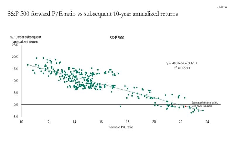
Source: Apollo Global Management chart, widely circulated on X in early May 2026. Republished by @Coffee__Capital with the caption “R^2 of 0.73 too...”
The chart is directionally right. Starting valuation does belong in long-run expected-return discussions, and the academic literature backs that up. The chart is also rhetorically overpowered. Rolling 10-year windows share most of their underlying data, valuation ratios are persistent by construction, and a high in-sample R² from a few hundred overlapping monthly windows does not translate into anything close to that level of forecast accuracy out of sample. The post you are reading is the methodology companion to Do Stock Valuations Still Matter? That guide makes the substantive case for valuation. This guide explains why the viral chart format overstates the precision of that case.
John Cochrane, a leading voice on this exact econometrics problem, replied directly to the latest viral version:
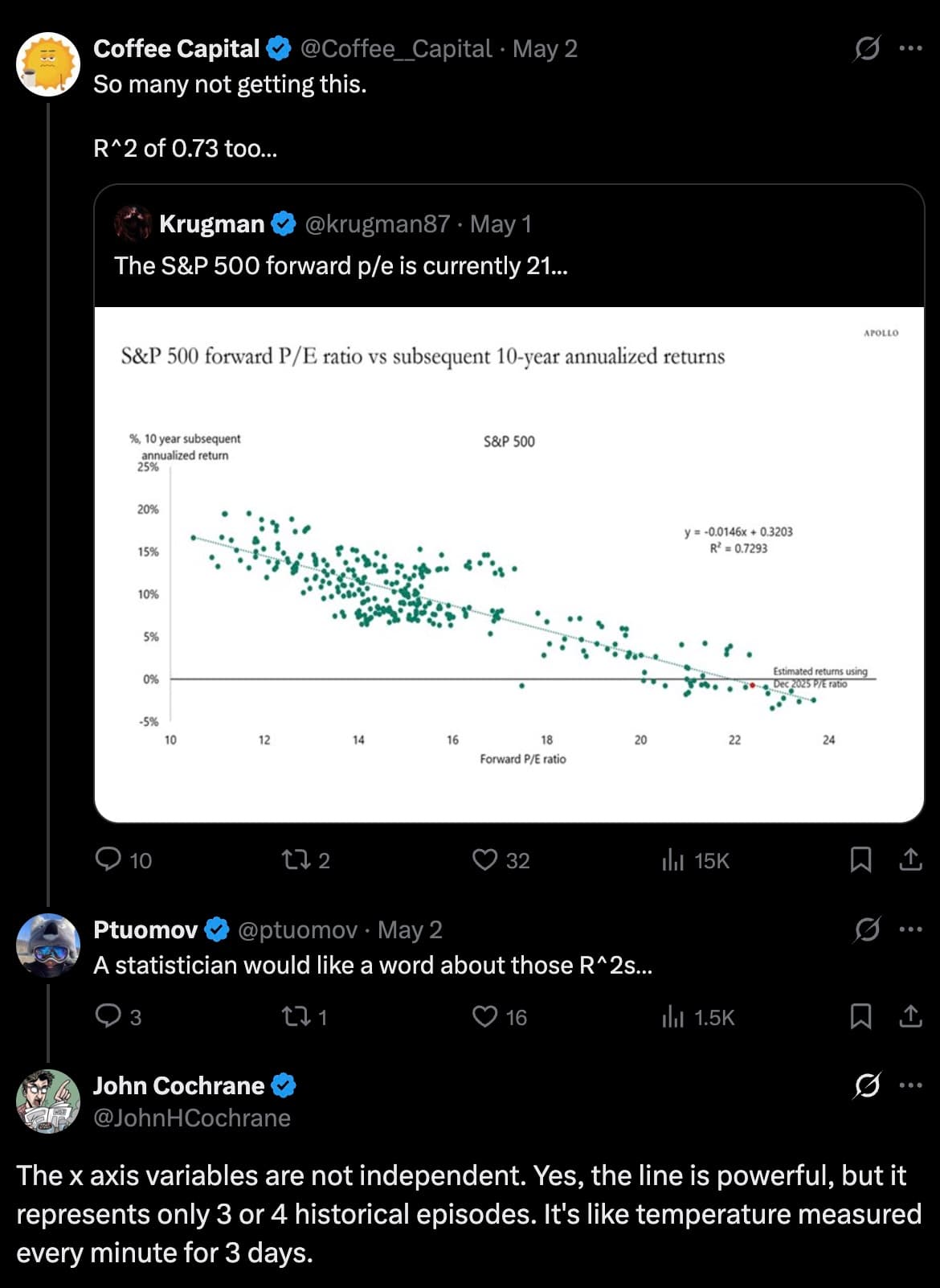
Source: John Cochrane on X, May 2026.
What These Charts Get Right
The economic intuition is sound. A stock index is ultimately a claim on future cash flows. If investors pay a higher price today for the same expected stream of earnings, dividends, and buybacks, future returns are mechanically lower unless growth or valuation surprise positively. That is asset pricing 101.
The empirical version of the claim is also well supported. Fama and French (1988) showed that dividend yields forecast future stock returns and that the regression R² rises with horizon: small on a 1-year forecast, climbing past 25 percent on a 4-year forecast. Cochrane (2008) formalized the framework: variation in the price/dividend ratio reflects variation in expected returns more than variation in expected cash flows. AQR, in their measured “Market Timing: Sin a Little” paper, summarized the literature as broadly supporting a valuation-return link, especially over 5-10 year horizons, while warning that practical market timing on the same relationship is much harder than the chart suggests.
For an individual investor, this kind of chart is useful for calibrating planning assumptions, not for market timing. If the next decade looks more like 2 to 4 percent real than 7 percent real, that flows through to retirement projections, savings rates, and withdrawal stress tests.
The Overlap Problem
Now the methodology critique. A 10-year rolling return, sampled monthly, is a moving average over 120 monthly returns. Move forward one month and 119 of those 120 returns are unchanged:
Under the simplifying assumption of independent monthly returns, the first-order correlation between adjacent rolling windows is approximately:
For a 10-year window sampled monthly, that is 119 / 120 ≈ 0.992. For 10-year windows sampled annually, it is 9 / 10 = 0.90. (The expression is exact for log returns and a close approximation for arithmetic returns; compounding adds a small nonlinear term.) The dots on the chart are largely the same handful of decades being re-measured with a 1-month or 1-year shift, not 360 independent votes about whether valuation predicts returns. Cochrane captured the intuition succinctly: “It is like temperature measured every minute for 3 days.”
The same point applies on the x-axis. Forward P/E does not jump randomly month to month. It moves through valuation regimes, often persisting at a given level for years. So both the dependent and independent variables are heavily autocorrelated. Two persistent, smoothly-evolving series regressed on each other can produce a strong in-sample fit even when the underlying relationship is weak or unstable.
R² Is In-Sample Fit, Not Truth
For a simple linear regression Y = α + βX + ε, the coefficient of determination is:
This formula measures how much of the variation in Y, in this sample, is captured by the fitted line. Causality, out-of- sample forecast accuracy, and the number of independent market histories represented in the chart are separate questions. The University of Virginia Library’s explainer works through several scenarios where R²misleads: “R² does not measure how one variable causes another, and it does not necessarily measure goodness of fit.” Penn State’s regression coursework adds the same warning: do not interpret R² in isolation.
A safer reading of the viral chart is: “The fitted line accounts for a large share of the variation among the plotted overlapping 10-year return windows in this historical sample.” A bad reading is: “Starting forward P/E explains 73 percent of future stock returns.” The blog format collapses the first into the second.
Long-Horizon R² Inflates Mechanically
Boudoukh, Richardson, and Whitelaw made the case rigorously in “The Myth of Long-Horizon Predictability” (Review of Financial Studies, 2008, 21(4): 1577- 1605). Their key result: when the regressor is persistent (such as a dividend yield, earnings yield, or P/E ratio), the OLS estimator of the slope and the implied R² are almost perfectly correlated across horizons under the null of no predictability. For dividend-yield-level persistence, they report a 99 percent analytical correlation between the 1-year and 2-year horizon estimators and a 94 percent correlation between the 1-year and 5-year horizons.
Plain English: if the relationship at the 1-year horizon looks weak (which it does empirically), the relationship at the 5- or 10-year horizon will look stronger by construction, not because the underlying signal is stronger. Visual R² climbs with horizon under the null. That is what the viral chart format exploits, even if the chart author did not intend to.
Naive Standard Errors Are Usually Wrong
Suppose someone runs a simple OLS regression on rolling monthly 10-year returns and treats every observation as independent. Under that (false) assumption, the standard error of the sample mean of N monthly observations is:
With serial correlation, the variance of the sample mean inflates. A standard adjustment for an autocorrelated process truncated at lag K is:
For overlapping 10-year windows where adjacent observations share 119 of 120 monthly returns, that bracketed correction factor can easily exceed 10. Naive t-statistics compute as if it were 1. Confidence intervals that look tight on the viral chart are therefore materially too tight; the size of the correction depends on the residual structure, the bandwidth of the kernel estimator, and the regressor used.
The fix has been canonical for decades. Hansen and Hodrick (1980) introduced an autocorrelation-robust standard error for overlapping observations in foreign exchange forward rates. Newey and West (1987) generalized the approach. Federal Reserve research uses Hansen-Hodrick, Newey-West, and reverse-regression methods routinely for long-horizon predictive regressions. The viral chart never reports them.
Stambaugh Bias: Persistent Regressors Distort OLS
There is a second econometric problem on top of the overlap. When the regressor is persistent (high autocorrelation, like dividend yield or P/E) and its innovations are correlated with returns, the finite-sample OLS slope coefficient is biased. Stambaugh (1999) derived the magnitude. The bias is approximately:
where φ is the autocorrelation of the regressor and T is the sample size. For dividend-yield regressions on 1977-1996 monthly data (T = 240), Stambaugh reports the empirical bias at roughly 0.42 of the OLS slope. Direction: typically toward rejecting the no-predictability null when it is true. Campbell and Yogo (2006) formalized efficient tests that correct for this. Most viral rolling-window charts ignore both papers.
Out-of-Sample Performance Is Much Weaker
A line that fits the past does not necessarily forecast the future. The standard reference is Goyal and Welch (2008) in the Review of Financial Studies, which won the Brennan Award for best paper. They tested a broad set of commonly cited equity-premium predictors (dividend yield, earnings yield, book-to-market, term spreads, default spreads, inflation, and so on) both in-sample and out-of-sample over 1927-2005. Their summary:
These models have predicted poorly both in-sample and out-of- sample for 30 years; these models seem unstable, as diagnosed by their out-of-sample predictions and other statistics; and these models would not have helped an investor with access only to available information to profitably time the market.
That is the practical bottom line. Campbell and Thompson (2008) offered a partial counterpoint: with sensible constraints (forecast restrictions, sign-imposed predictions), out-of-sample predictability can be salvaged for a small but economically meaningful equity-premium edge. Cochrane (2008) adds a further nuance: poor out-of-sample R² does not by itself reject in-sample return forecastability; out-of-sample tests are stricter and a model can carry real economic information even when its OOS R² is unimpressive. The synthesis across this literature is that valuation-based models carry real but modest information, much smaller in magnitude than the in-sample R² on a viral rolling-window chart implies.
Forward P/E Specifically: The Particular Problems
The Apollo chart uses forward P/E, not Shiller’s CAPE or a trailing earnings ratio. Forward P/E has its own quirks worth flagging:
- Short sample. Reliable consensus forward-earnings data generally begins in the late 1970s or early 1980s, depending on the vendor and definition (I/B/E/S began compiling 12-month forward consensus for the S&P 500 in January 1979). Shiller’s underlying data go back to 1871, and CAPE-style 10-year averages become usable around the early 1880s. A forward-P/E vs 10-year-return chart covers at most 30-35 years of starting valuations, which contains roughly 3 to 4 truly independent decades. Cochrane’s reply put the same number on it.
- Analyst-estimate dependence. Forward earnings reflect bottom-up consensus from sell-side analysts. The denominator moves with both fundamentals and analyst psychology. CAPE’s 10-year backward average is more mechanical.
- Hidden uncertainty. The fitted line is a point estimate. The chart almost never shows a forecast interval, which is what an investor actually needs.
- Margin-cycle dependence. Forward P/E depends on assumed forward margins. If margins compress back toward historical norms, today’s “cheap on forward” looks expensive on realized earnings.
For context, here is the same chart pattern shared by Mike Zaccardi back in late 2024, showing the same downward-sloping relationship and the same visual density:
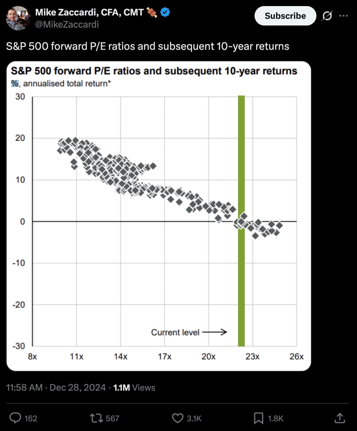
Source: @MikeZaccardi on X, Dec 28 2024 (1.1M views). Same chart, same period in history, seventeen months apart. The format keeps getting reposted.
Effective Sample Size: A Worked Number
Take a typical version of the chart: 35 years of monthly data with a 10-year forward window. That gives roughly (35 - 10) × 12 = 300 plotted dots. Adjacent dots share 119 of 120 monthly returns, so the rolling-window autocorrelation is approximately 0.992.
For an AR(1) process with first-order autocorrelation ρ, the effective sample size of the average is:
Plug in N = 300 and ρ = 0.992 and the AR(1) shortcut gives:
N_eff ≈ 300 × 0.008 / 1.992 ≈ 1.2
That is probably too pessimistic, because rolling-window autocorrelation truncates after the 120-month return horizon rather than decaying geometrically forever. A pure 120-month moving average gives a variance-inflation factor closer to 120, so a moving-average treatment lands at:
N_eff ≈ 300 / 120 ≈ 2.5
Both numbers are illustrative. The exact value depends on how the persistence is modeled. The key point is the order of magnitude: the chart represents roughly 2 to 4 independent 10-year episodes, not 300. Cochrane’s “3 or 4 historical episodes” reply lands inside the same band.
The Spurious R² Demonstrator
The simulator below generates synthetic monthly returns and a persistent “valuation” series, computes the rolling forward-return scatter, and reports the apparent in-sample R² alongside the theoretical R² of the data-generating process. The default setting is true correlation = 0: the two series are independent by construction. Press Reroll a few times. R² values of 0.20 to 0.50 routinely appear from nothing more than persistent regressors and overlapping windows.
Chart Hygiene Checklist
Before trusting any rolling-window valuation-vs-return chart on social media or in a research piece, ten questions worth asking:
- Are the return windows overlapping? If yes, the dot count is not the sample size.
- How many independent long-horizon periods are actually in the sample? For a 10-year window in 35 years of data, typically 3 to 4.
- Are returns nominal, real, or excess over cash? Different choices give different lines.
- Is the valuation metric point-in-time or revised? Forward P/E uses analyst estimates that get revised retroactively.
- Does the chart show confidence intervals? A point estimate without an interval hides the uncertainty that should drive the planning decision.
- Does the regression use autocorrelation-robust inference? Hansen-Hodrick, Newey-West, or equivalent. If not stated, assume not.
- Does it work out of sample? In-sample R² and out-of-sample predictive accuracy are different questions (Goyal-Welch).
- Does it survive different start and end dates? Sliding the sample window changes the number on most charts.
- Is it U.S.-only? The relationship is much weaker in some international samples.
- Is it being used for planning or for timing? The literature supports the first more than the second.
What This Means for DIY Investors
Three practical takeaways.
1. Lower your forward return assumptions when valuations are high. The chart is right that high starting valuations have, on average, been followed by lower long-run returns. When valuations are high, it is reasonable to stress-test plans using lower real-equity-return assumptions, such as 2 to 4 percent real for a decade, alongside long-run historical averages rather than only anchoring on a single 7 percent number. The Summitward guide What Real Return Should You Assume for Stocks? walks through that recalibration.
2. Widen your planning uncertainty band. Whatever number the fitted line spits out, realized 10-year returns can land several percentage points per year above or below the fitted-line estimate. Monte Carlo planning, with a wide forecast interval, is the right tool here rather than a point forecast. See Monte Carlo Retirement Simulation.
3. Avoid all-or-nothing market timing. Even when the in-sample relationship looks tight, Goyal-Welch showed the same predictors fail out of sample. AQR’s “Sin a Little” framing is the right one: small, slow, valuation-aware tilts are defensible; binary cash-or- equity moves are not. The Summitward guide The Problem With Buy the Dip covers the related issue of why timing rules look better in backtests than in real time.
Frequently Asked Questions
Is the viral chart wrong?
Not exactly. The slope is in the right direction. The R² is descriptively true for the sample plotted. The problem is the implied precision: that the fitted line forecasts the next decade with anything close to a 73 percent explanation rate. Out-of-sample evidence and inference-aware methods produce much more modest predictability estimates.
How is CAPE different from forward P/E for this purpose?
CAPE has a longer history (Shiller’s data from 1871, with 10-year averages usable from the early 1880s) and uses backward-looking 10-year average inflation-adjusted earnings, which makes it less dependent on analyst estimates and more comparable across regimes. The same overlap problem applies to CAPE-vs-10-year-return charts, but the longer sample gives more independent decades to look at. See Do Stock Valuations Still Matter? for the substantive case.
If the relationship is real, why does Goyal-Welch find weak out-of-sample predictability?
Two reasons. First, in-sample fits use information from the future to fit the past. Out-of-sample tests only use information available at the time. Second, valuation relationships drift: the average CAPE of 16 in the first half of the 20th century differs from the average CAPE of 25 in the recent two decades. A model fit to one regime can mispredict in another.
Should I sell stocks because the fitted line says future returns will be low?
No. The forecast interval is wide, the out-of-sample evidence is weak, and selling stocks creates real costs (taxes, re-entry timing risk, sequence risk if cash underperforms). Use valuation to set conservative planning assumptions, not to make binary allocation moves.
What about Shiller’s “Excess CAPE Yield”?
It addresses one of the criticisms above by netting CAPE yield against the real bond yield, which compares stocks to their actual risk-free alternative. It still suffers from the rolling-window-overlap problem when plotted against subsequent returns. Treat it as a planning input, not a forecast.
Related Guides
- Do Stock Valuations Still Matter? What CAPE Tells You About the Next Decade is the substantive companion to this guide. Together they cover both halves: yes valuation matters, no the chart is not as precise as it looks.
- What Real Return Should You Assume for Stocks? covers planning assumptions in light of the global return history.
- Do 200 Years of Stock Returns Still Matter? treats regime dependence and the McQuarrie historical-data corrections.
- Monte Carlo Retirement Simulation is the right framework for translating uncertain return forecasts into a plan.
- Safe Withdrawal Rate: Why the 4% Rule Isn’t Enough is where lowered return assumptions actually bind on a retirement plan.
- The Problem With Buy the Dip covers a related case of timing rules that look better in backtests than in real time.
Key Takeaways
- The viral chart is directionally right. High starting valuations are associated with lower long-run returns. The Fama-French, Cochrane, and AQR literature backs that up.
- The R² is overstated by construction. Adjacent monthly 10-year windows share 119 of 120 returns. Effective sample size is single-digit, not several hundred.
- BRW (2008) showed long-horizon R² inflates mechanically under persistent regressors, even under the null of no predictability.
- Naive standard errors are too small. Hansen-Hodrick or Newey-West corrections typically widen confidence intervals by a factor of 3 or more.
- Stambaugh (1999) bias adds a second distortion when persistent valuation ratios predict returns and innovations are correlated.
- Goyal-Welch (2008) found out-of-sample predictability is much weaker than in-sample fits imply, and would not have helped a real-time investor.
- For DIY investors: use valuation to set conservative planning assumptions and widen uncertainty bands. Do not use it to make all-or-nothing allocation moves on the strength of a fitted line.
More in Investing & Portfolio
Browse all investing & portfolio guidesGet new guides by email
Evidence-based, no jargon. At most two emails a month. Unsubscribe any time.
Try it in Summitward
See portfolio factor analysis in action with your own financial data. Free to start, no credit card required.